Situations Design Diary 4: Visual Design
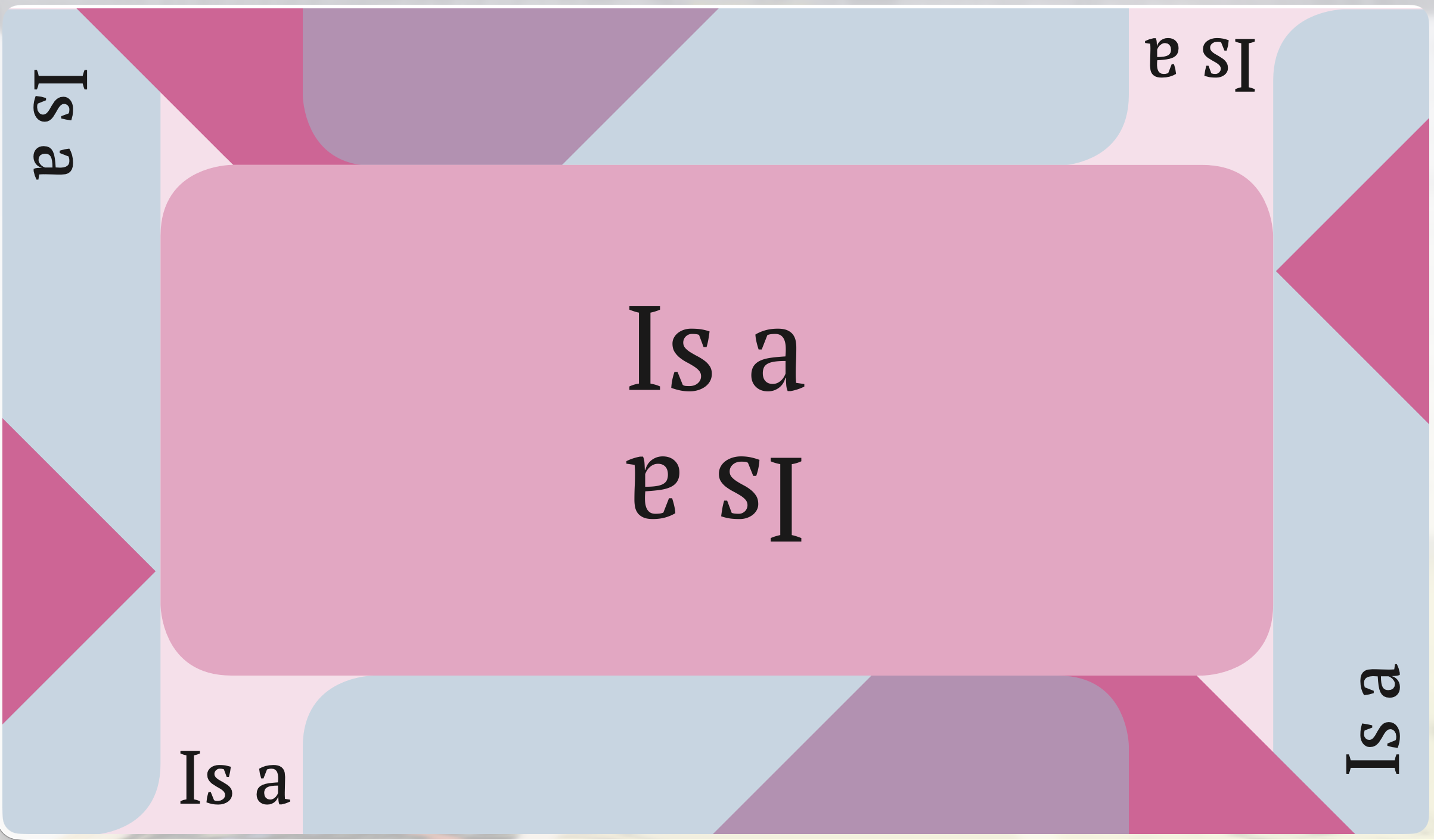
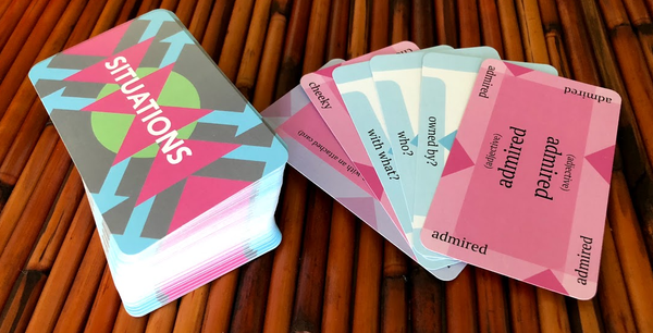
The final designs of the Situations cards
The aesthetic of Situations is obviously very minimal. I used flat design with an essentially 3 color palette - blue, pink, and white (with a splash of green on the back left over from the Action Cards that didn't make it into the final game - more about that here). Every piece of the visual design of the cards is designed to suggest and reinforce the intended arrangement of the cards on the table during play.
On first blush, I think most people would expect a story writing game to have a much more vivid and representational style. Maybe something painterly, and a bit whimsical. This is definitely typical for board games in general.
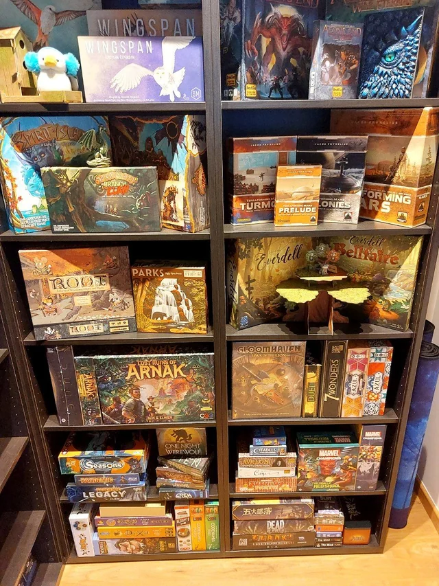
I chose not to follow this style. I felt that any representational art style would set a clear tone, and I wanted players to be able to write stories with any tone and genre that they chose. The deck also intentionally has many words with multiple meanings - using illustrations would send players down the path of one particular interpretation. Plus, a style that is very different than other games sticks out on a shelf!
Color Palette
I settled on the color palette very early in the design of the game. The idea of using clearly separated colors to represent the different types of cards was in one of the very first drafts. I went with these colors that were bold but without strong positive or negative connotations, and very different in quality than the typical colors in board game art.
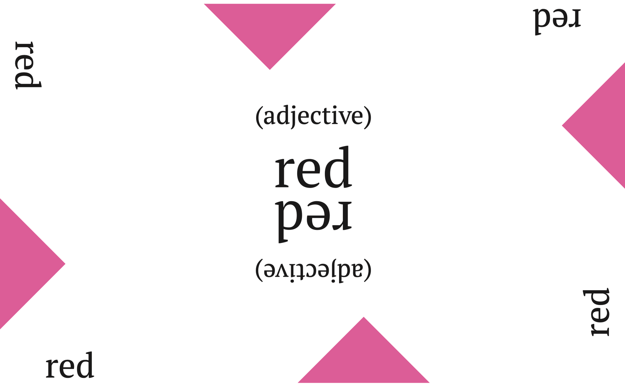
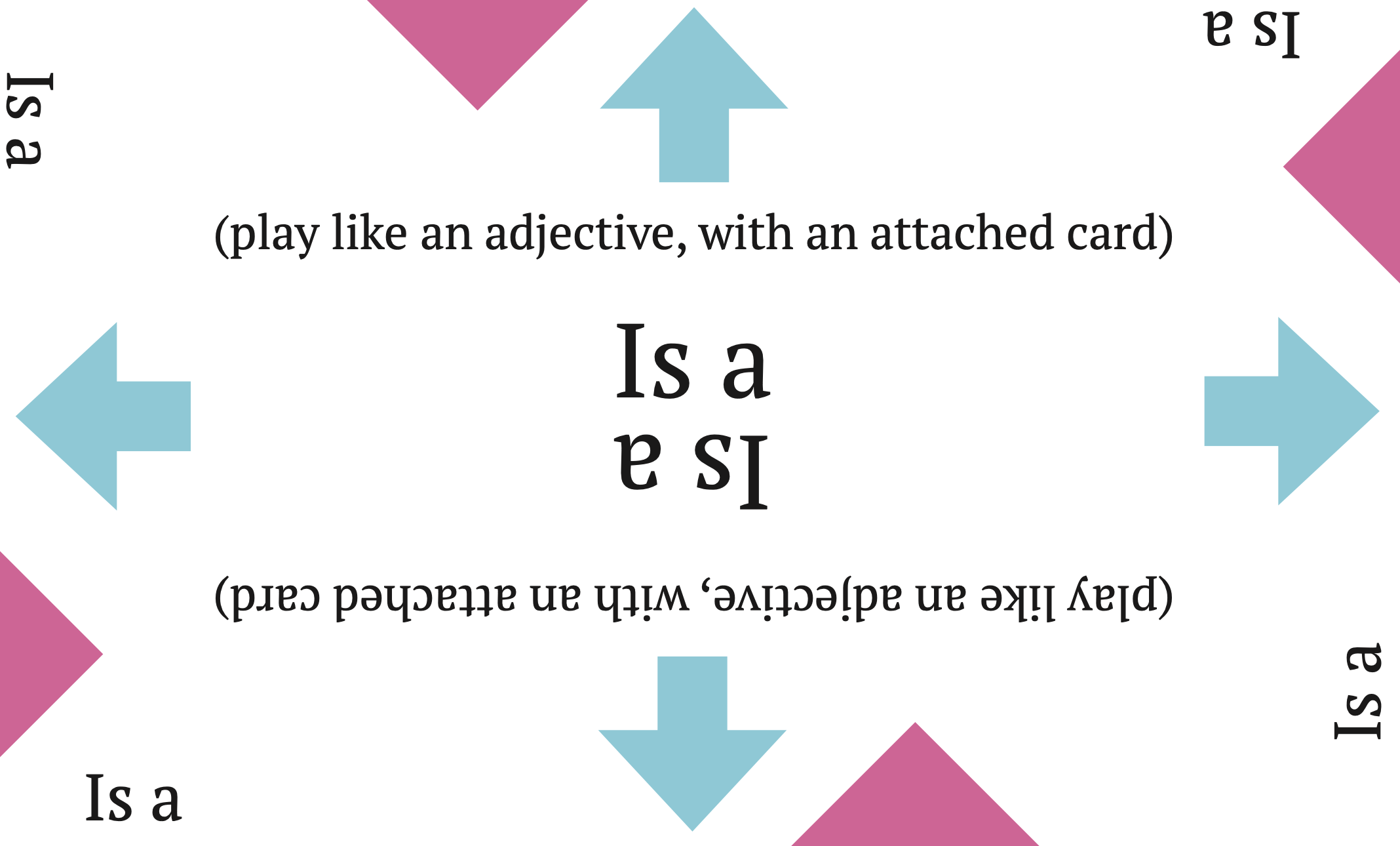
One of the earliest drafts of the card fronts. The design is quite different, but the colors are the same!
I got feedback from stores that stocked Situations that it really does show up very well on shelves, so I think this was successful!
While I'm here let me just point out one of my favorite little uses of the color palette:
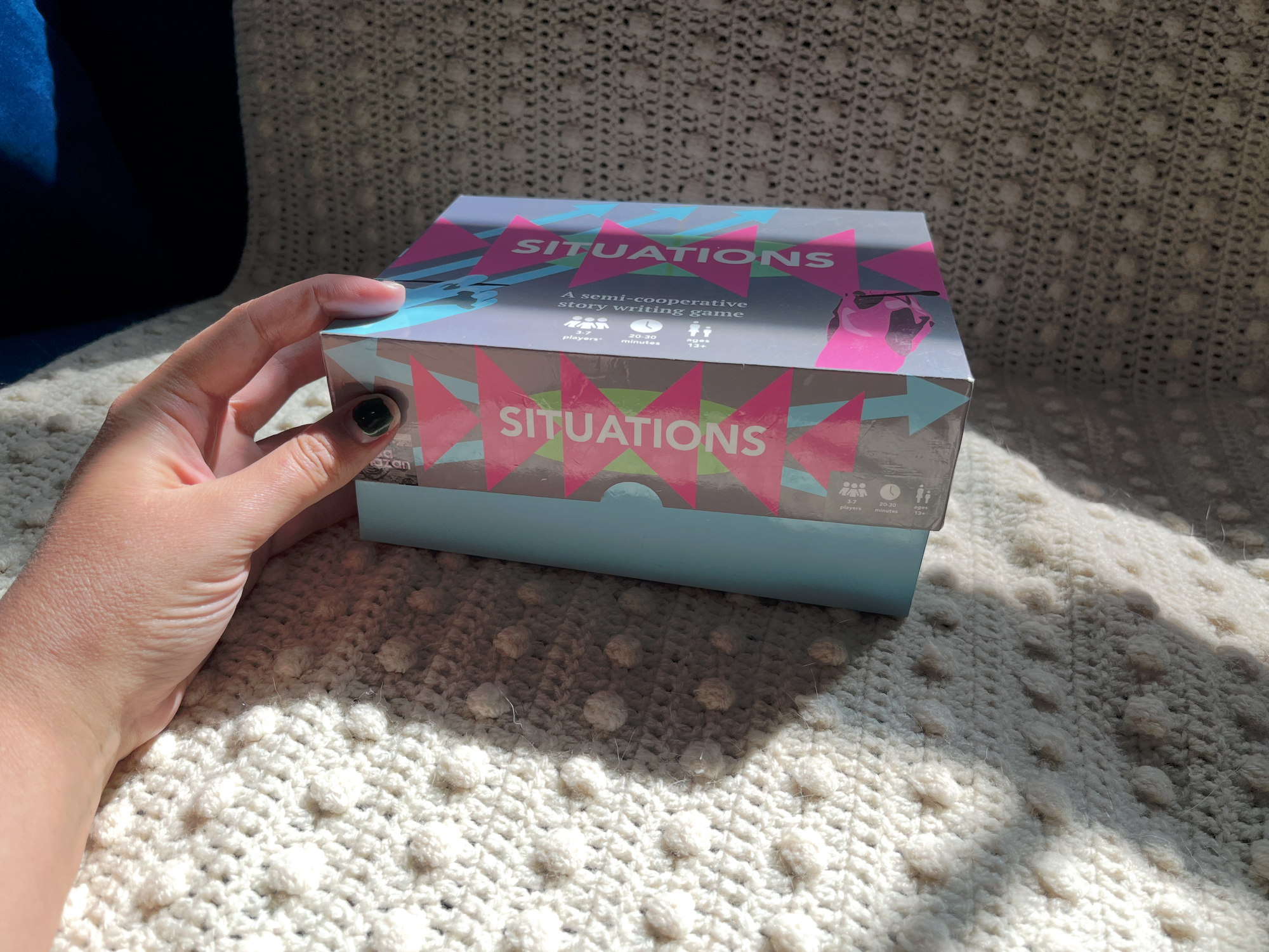
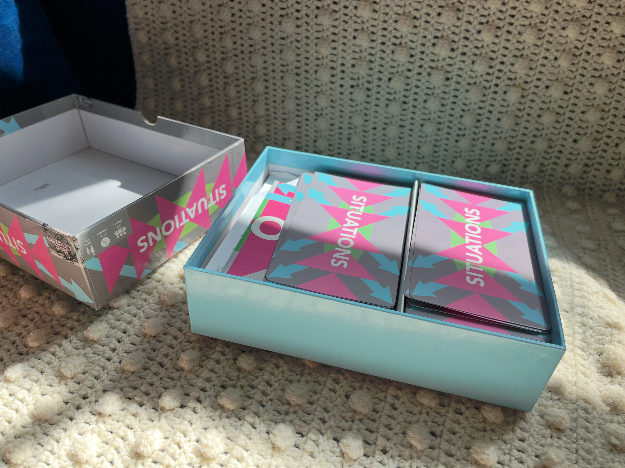
When you see the closed box, just a teeny bit of the vibrant blue is revealed through the thumb handle in the box lid. As you open the box, the color is revealed. I think lots of board games try and hide the existence of this inside box section rather than using it for a fun reveal, but I think using it this way is much more joyous.
Designing the cards
Nouns
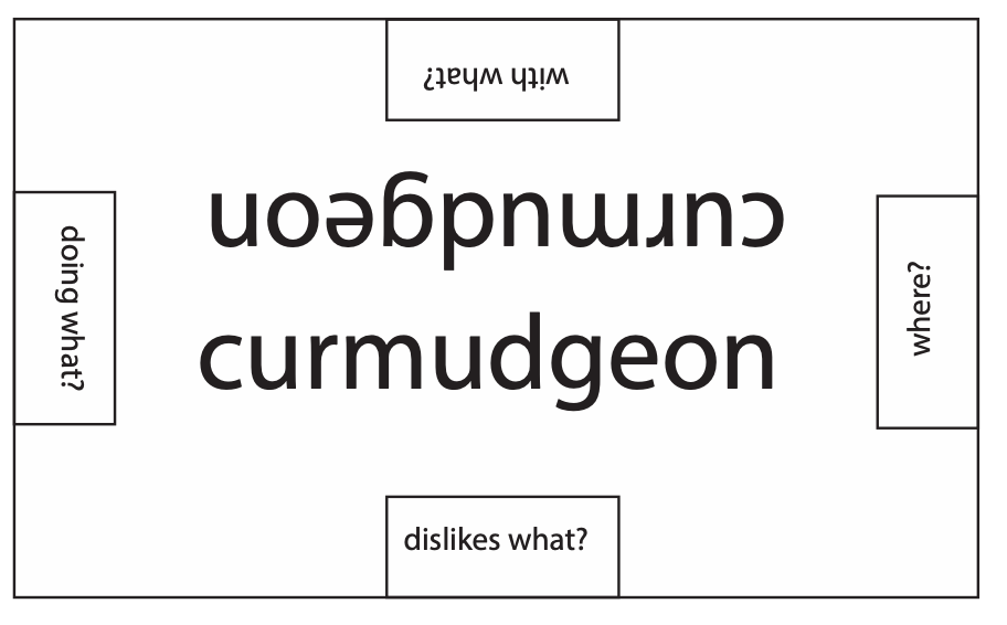
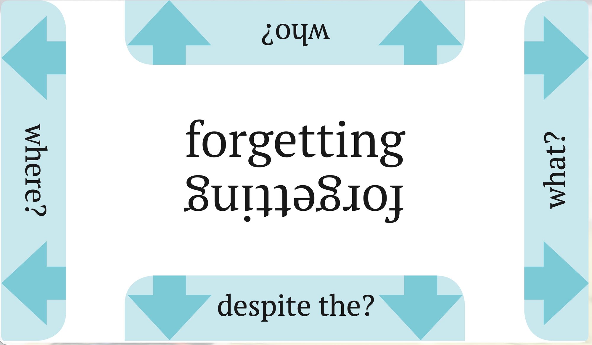
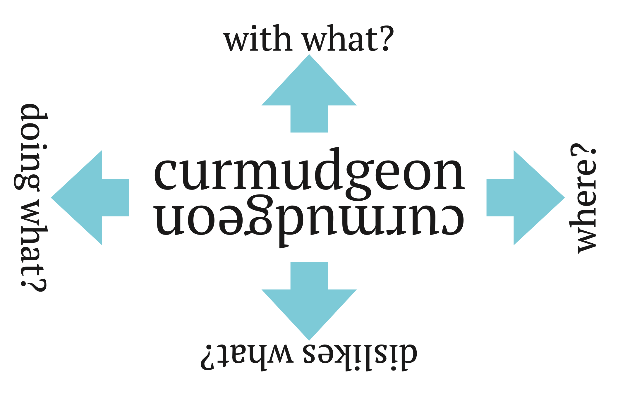
This is the first draft of the noun card. It's very simple - the noun in the middle, once in each direction to make it readable from both sides, and questions on each side. I used this in my first playtests, and the major issue that came up was that it was hard to know which direction the questions went. If you have Curmudgeon connected to Hero along the "Dislikes what?" edge, which was do you read it? The curmudgeon dislikes the hero, or the hero dislikes the curmudgeon?
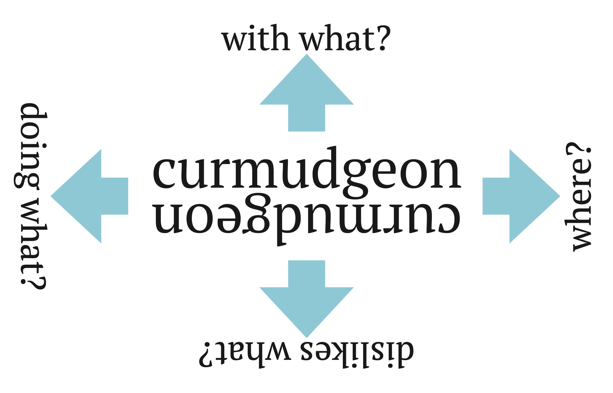
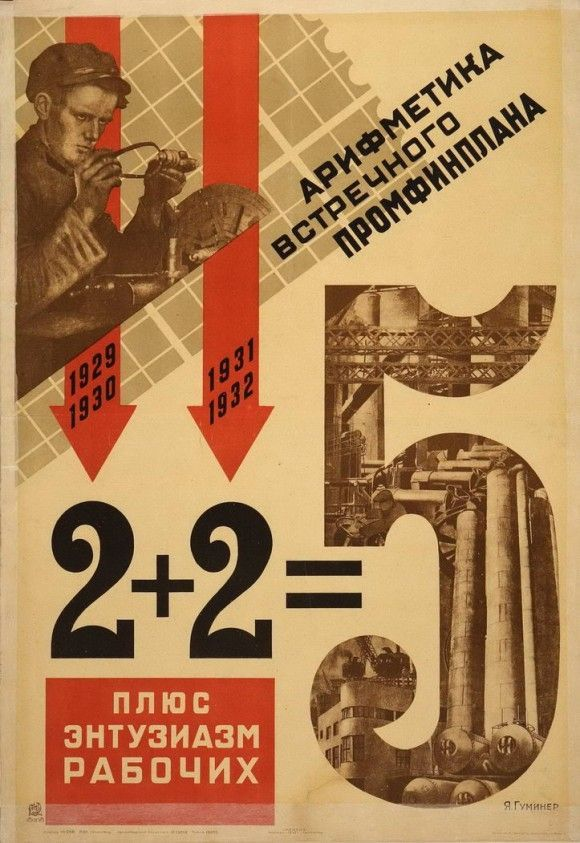
The goal of this second draft was to address this. The arrows are intended to guide you in what direction to read. Adding these arrows ended up being a strong influence in the visual language of the game. It reminded me of Russian Constructivism - those guys famously loved arrows. The geometric style of the final design is deeply influenced by Constructivism.
The final design was influenced by the largest change during development of how the noun cards connect - adding one-way linking. This involves laying the edge of one noun card underneath another in order to hide the question that's not being answered.
In order to guide players in laying the cards this way, I added a silhouette of a card underneath the questions. That way when a card is tucked underneath another one, the bottom card is visually "completed" by the design on the top card.
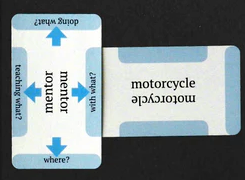
The issue with this design is that when you cover one card, the arrow on the other card is still visible. This is sort of an odd detail - it doesn't give you a lot of clarity on which way to read.

To fix this, I moved the arrows onto the shape that is covered by the top card, leading to the final design:
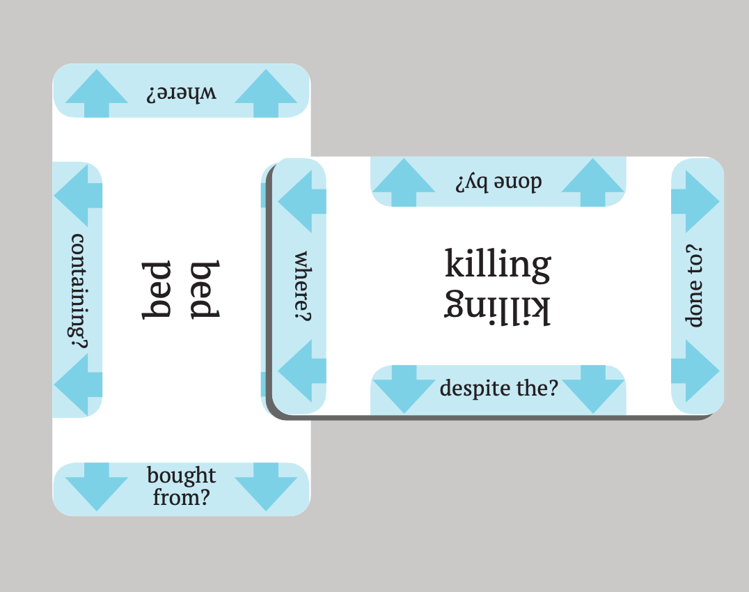
Adjectives
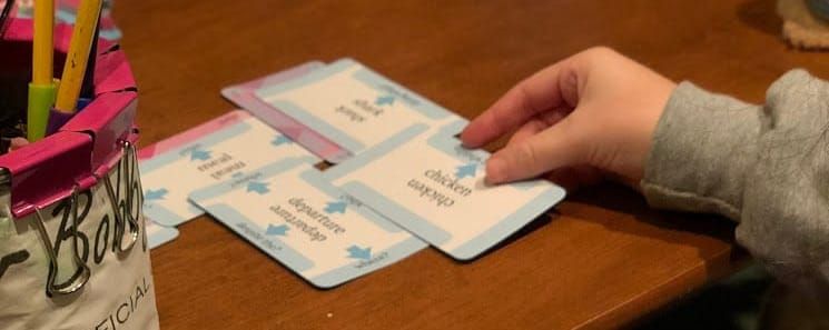
The main constraint of the adjective cards is that they need to be readable when tucked under nouns. I was inspired by how cards get tucked underneath each other in other games.
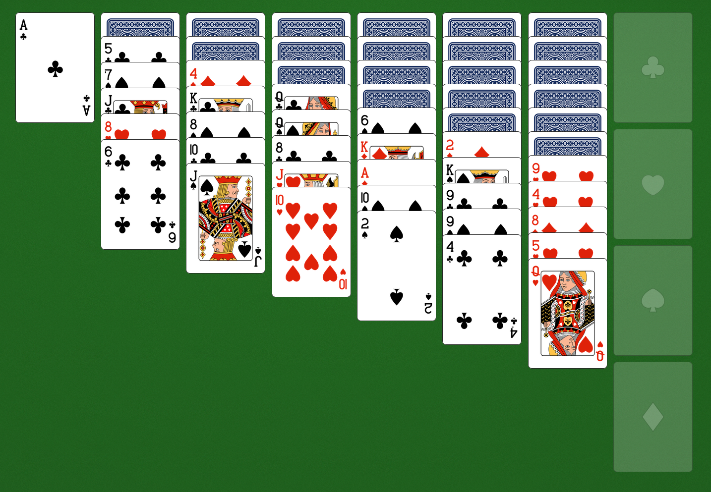
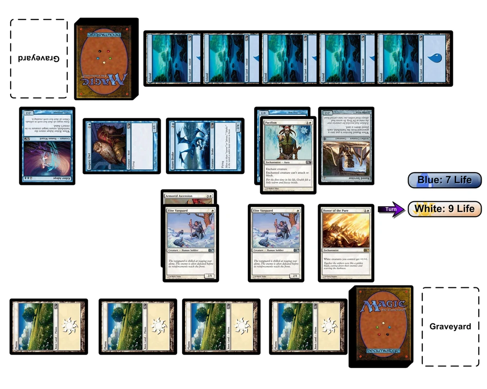
Cards tucked under other cards in other games
I took the symmetry from regular playing cards - I appreciate that they can be tucked at any angle, which is of course very helpful when the Situation gets complicated and there are cards sticking out every which way, since it lets you reposition the adjectives to wherever they're most easily read.
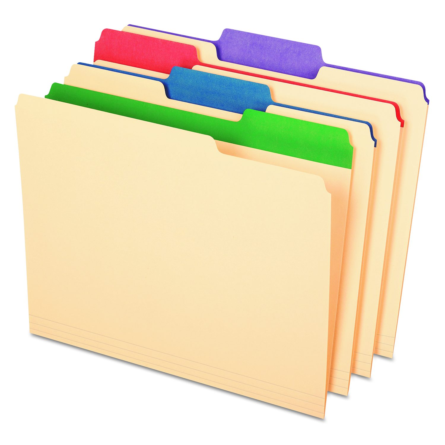
My other inspiration was manila folders - I intended the section of the card with the actual adjective to read as something like the tab on a folder sticking up with a label. The idea was that the triangles on the card cut out the "tab" shape in the negative space.
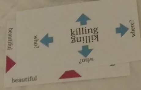
In hindsight, I think this was a little too high-concept. Because there are negative space "tabs" on all four corners, you get enough bits of the other tabs that aren't intended to be revealed sticking out that the design doesn't read clearly at all. Oh well, you live and you learn. If I ever do a second print run, I'll definitely work on trying to make these tabs read more clearly.
In part because the tabs didn't read as clearly as I had hoped, players were not finding it intuitive where to tuck the adjectives under the nouns. My next draft include the "shadow" of the four positions that a card could go on top of the adjective.
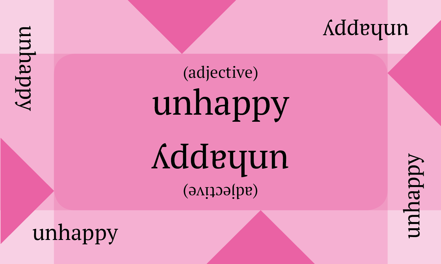
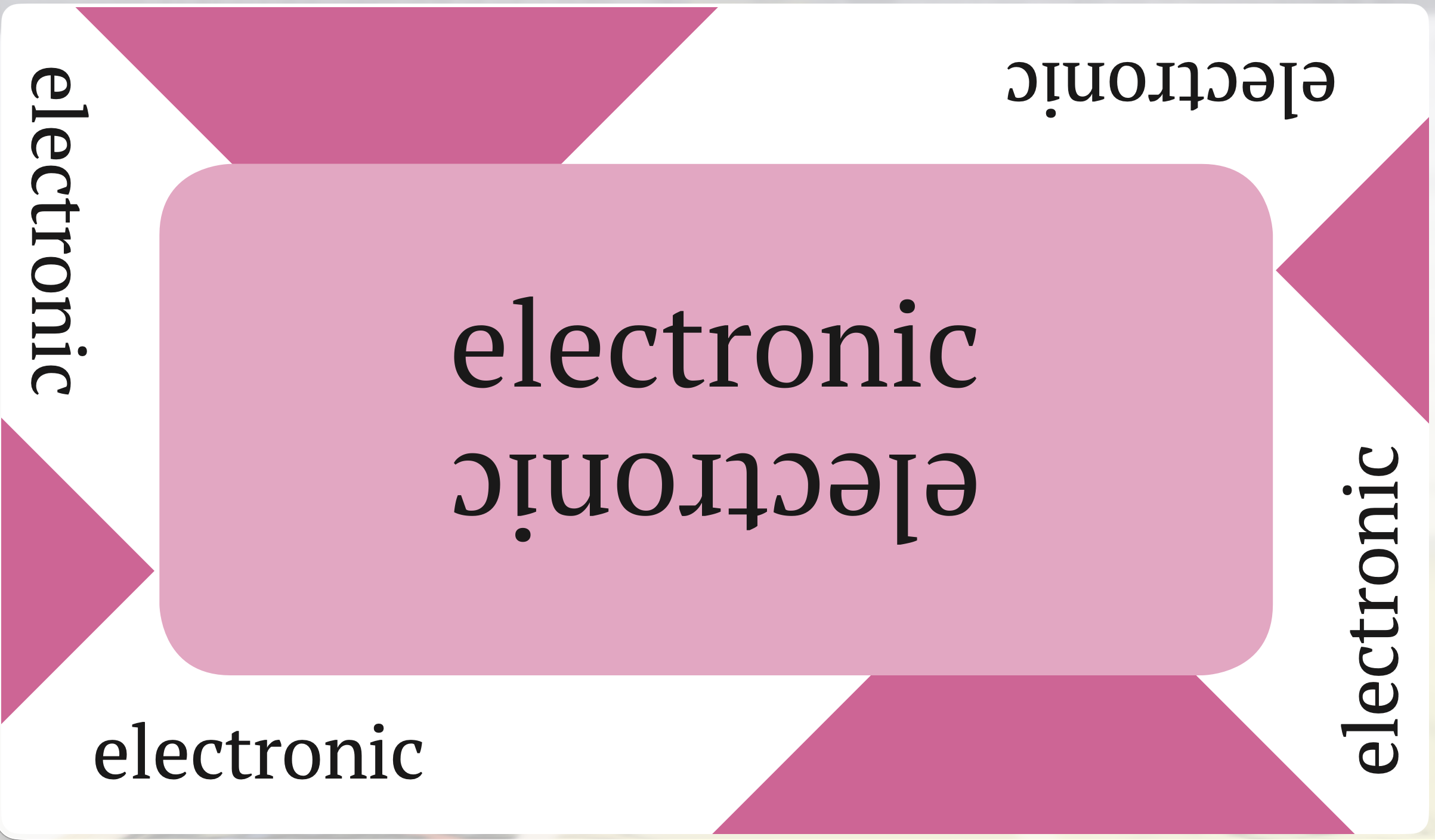
This was quite busy and made the tabs read even less clearly because there was no more plain white negative space. The final design takes the intersection of the four "shadows" and leaves the actual "tabs" white. The shape at the center still provides a guide as to where you can align a card to sit correctly on top of the adjective.
Is A card design
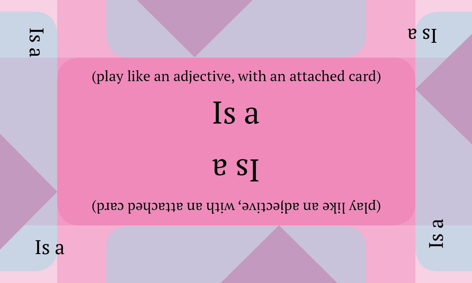
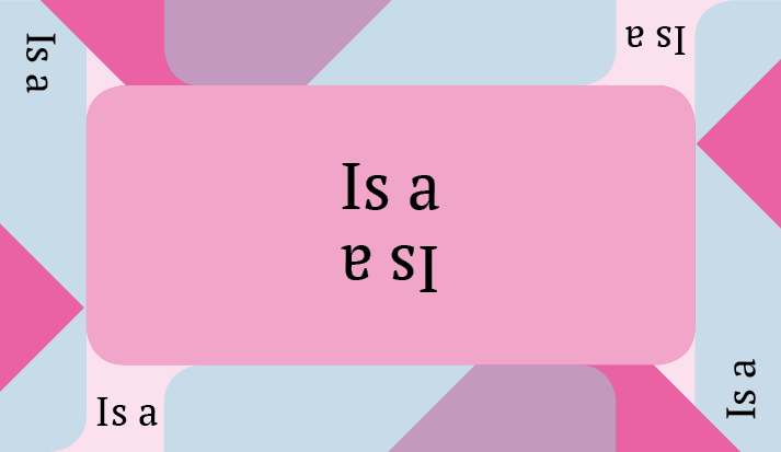
Evolution of the Is A card design
While the Is A card design evolved over the course of the design of Situations, the concept never changed. From the beginning I conceptualized it as an adjective card that added a noun card-style connection, so the design was always a combination of the noun and adjective card designs, essentially superimposed on top of one another. The geometric features are intended to both guide the player in tucking it under the card that "is" another card, and connecting the card that that card "is" by tucking the edge under.
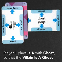
In hindsight, I don't think this really reads. Is A is a symmetrical relationship anyway, so players often just put each card that it connects under opposite sides of the Is A card. I think if I ever do a second print run I'll redesign the card so that it canonically simply attaches on either end, rather than doing this complicated "adjective + noun" bit. I also don't know why I left the negative space slightly pink in the final design, when that negative space is entirely white in the final adjective card design. Hmm...
And card
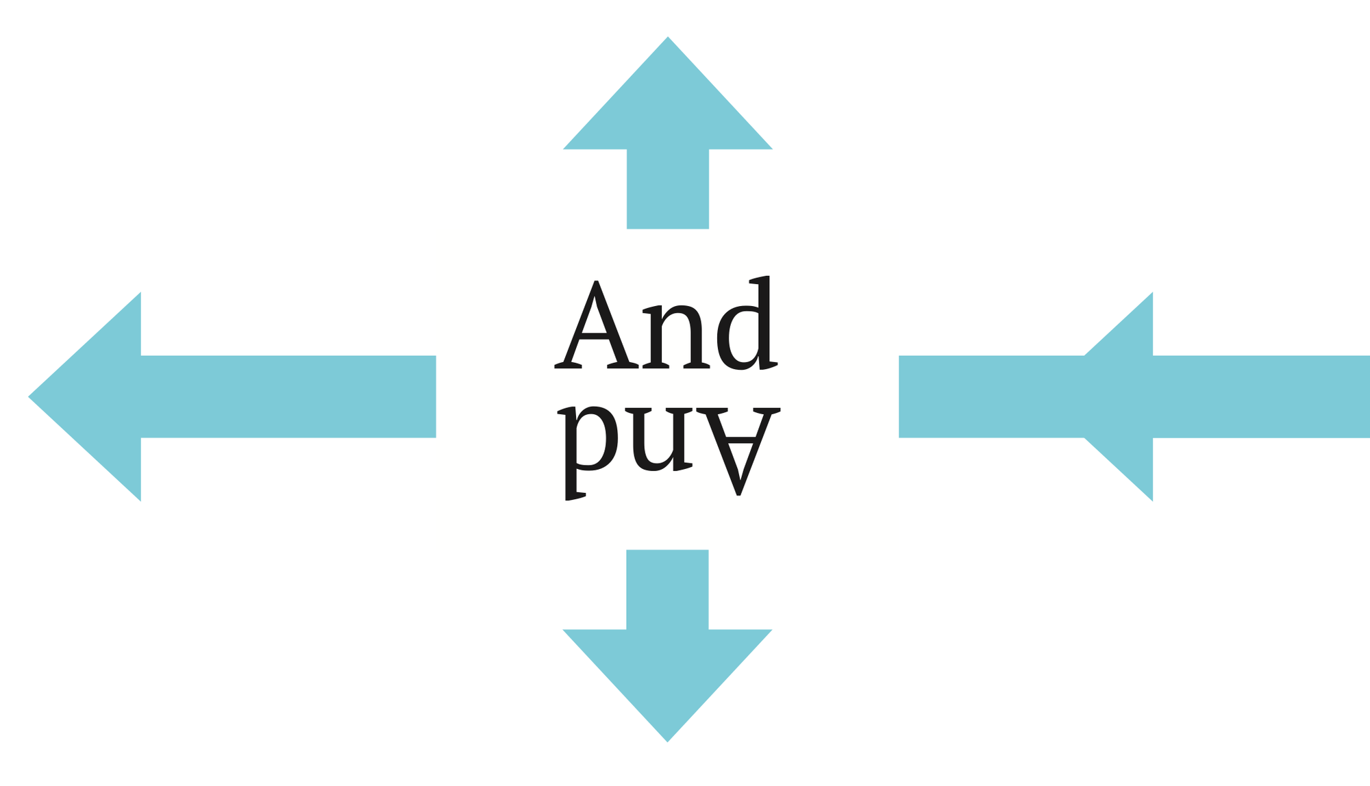
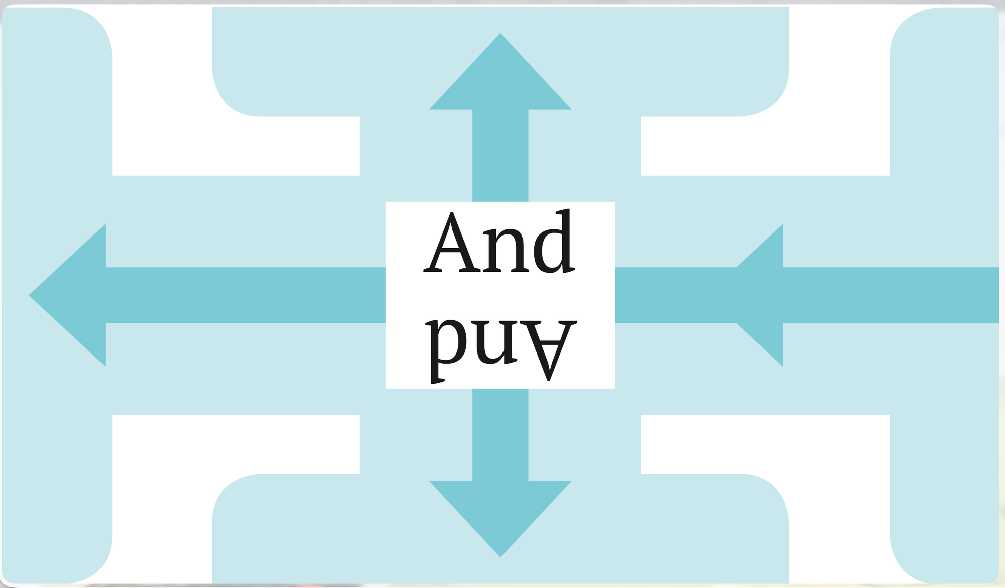
Evolution of the And card
The And card makes a single question on a noun card apply to multiple nouns, so it extends the arrow from that question to point towards all four edges. This made more sense when there was a single arrow, but I still think is decently clear in the final two-arrow noun card design.
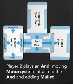
I'm pretty happy with this, I think it's a fun play with the geometry. I believe in the final printing of the card, the shadows on the wide edge of the And card are actually the correct width to visually complete a card tucked under them, instead of a little bit too wide like in the picture in the instructions.
Card back
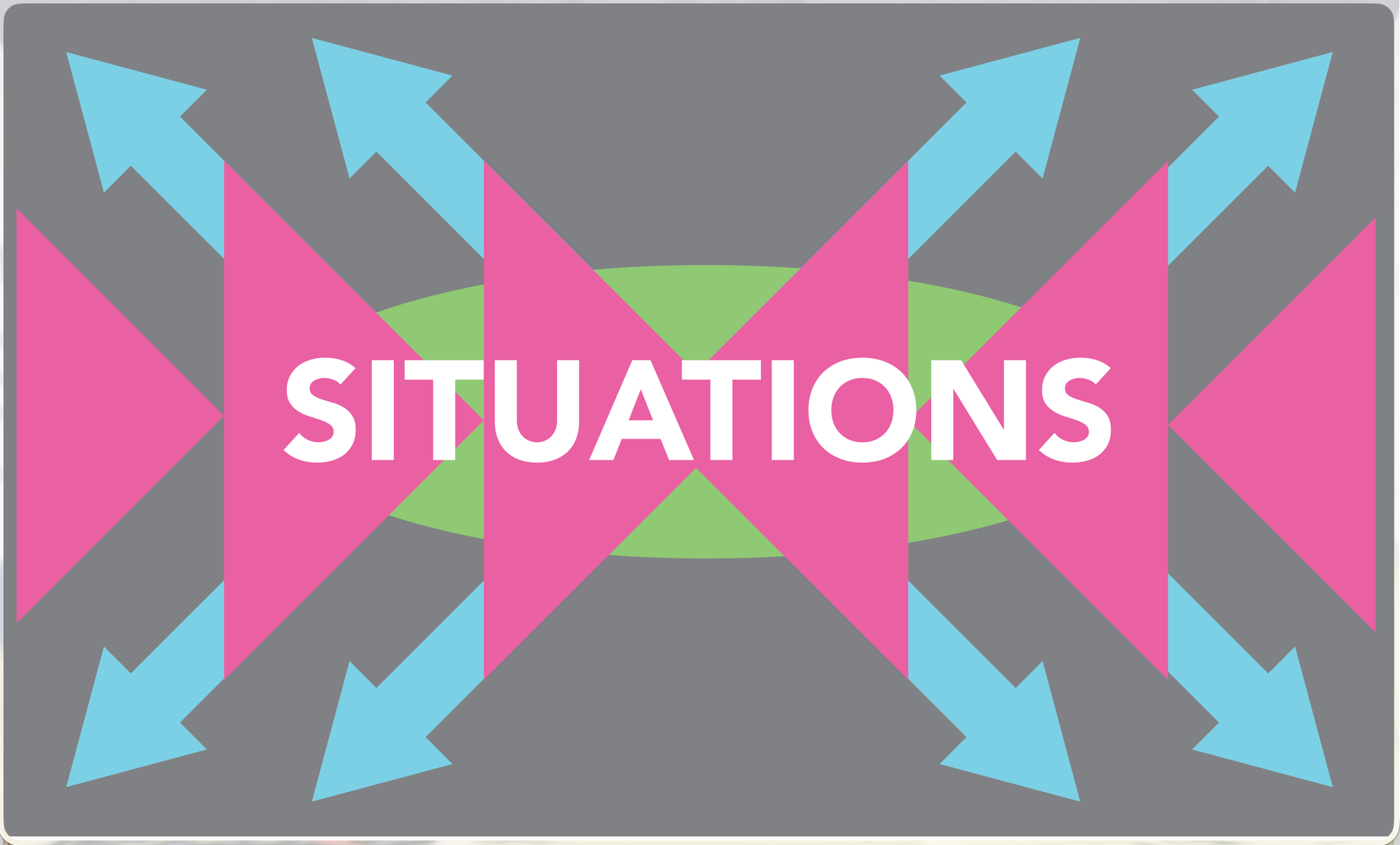
The card back is entirely built out of the geometric components that appear on the actual cards. It uses the triangles from the adjective cards and the arrows from the noun cards. If you're wondering about the green circle - that comes from here:
At the time I designed the card back, there were cards that took an immediate action that used green half-circles as their geometric motif. I discuss why I removed them in a previous post. I kept the green shape on the card back for a couple reasons. First of all, since I planned to make expansion packs, I thought that the action cards might return in a future expansion pack aimed at fans of more "game-y" games. Second of all, I liked having the third color - just pink and blue felt too empty.
The third reason were these tension points:
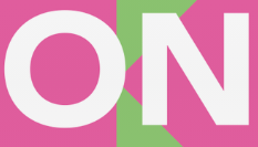

The way that the triangles intersect behind the lettering is quite awkward. The green shape definitely does not resolve it - this tension point is still probably the aspect of the visual design that most bugs me - but it's less stark than the other options I considered at the time. Removing the green shape increases the contrast between the pink and the gray background, which makes this awkwardness even more obvious. Adding a pink box behind the lettering made the triangles not read clearly.
If I were to take another stab at this now, I would try having the triangles overlap each other rather than touch at a single point, to create less of a single point of tension. If that didn't work, I would resize the text until the points fall at a location with a clearer relationship to the text. But I'm older and wiser, and since it's the card back I can never change it unless I break backwards compatibility 😄
Oh well, every Magic: The Gathering card still says "Deckmaster"...
The box art
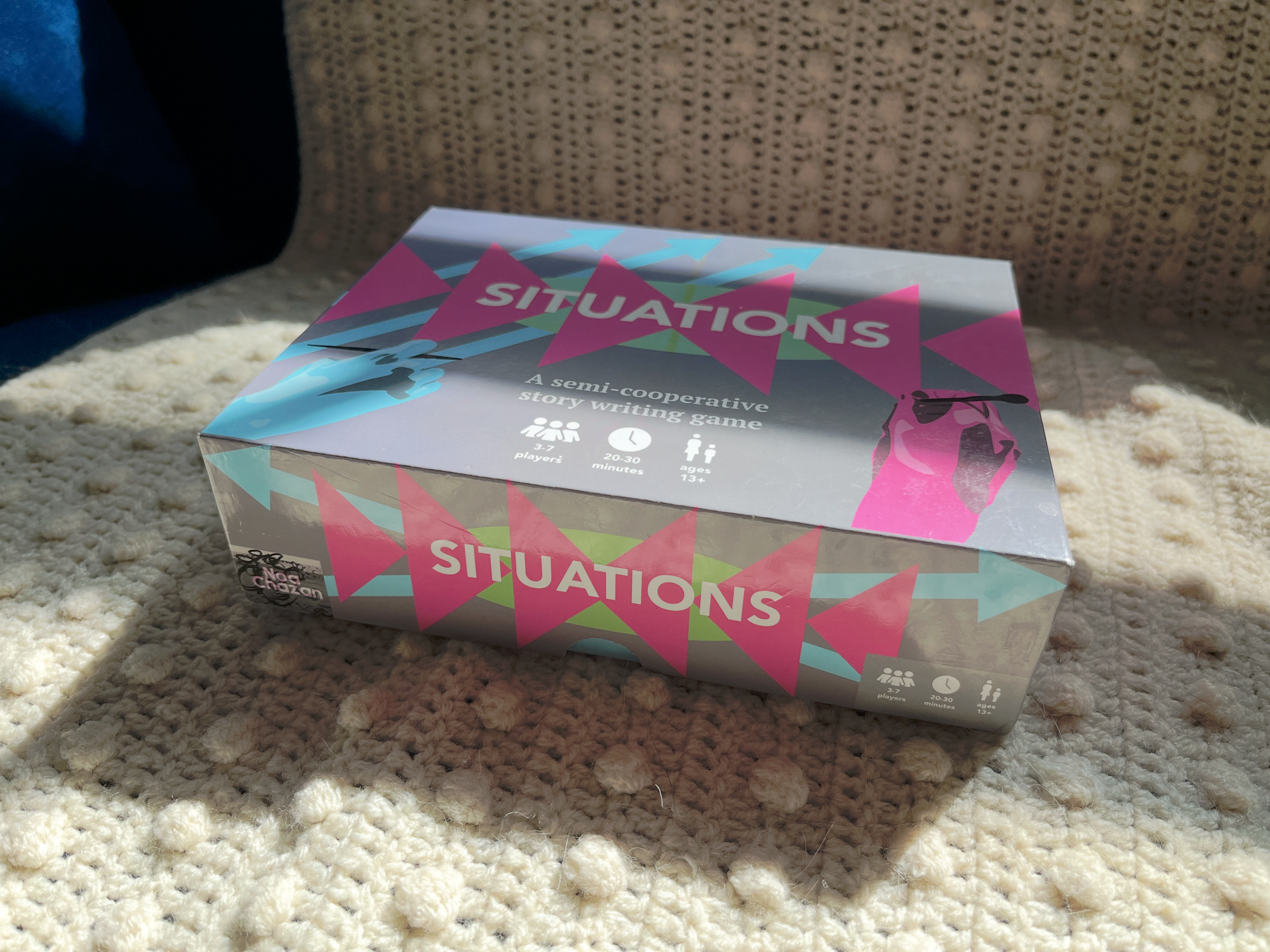
The box art is mostly based on the card back. I moved the arrows around a little bit to create some interest and leave space for the tagline and the information about players and duration. I decided that this didn't provide a clear enough sense of what this game is actually about, so I added hands in the process of writing. I traced these from photos of my own hand to keep them in a geometric style within the color palette. If I were really serious about the Constructivism, I probably should have made them black and white photographs and set them in a circle-shaped cutout or something like that, but I'm pretty pleased with it.
Typography
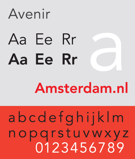
The logotype is set in Avenir. I wanted something that matched the geometric style, something sort of Bauhaus-y.
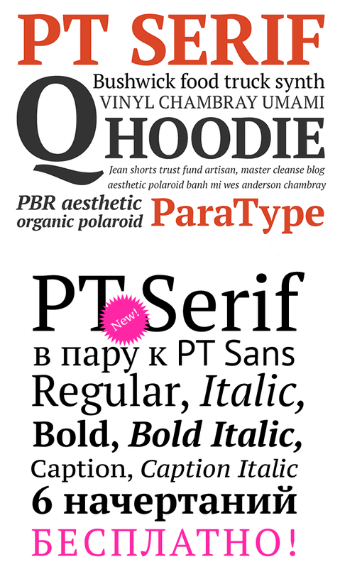
I used PT Serif for everything else. It feels a little bit literary to me, which is an important feeling for Situations to have and not particularly conveyed by the more austere modernist design influences elsewhere in design.
& of course the icons on the box are from The Noun Project. Incredibly useful if you need some minimalist, legible icons.
Previous post: Selecting words
The next post will be on my experience marketing and selling the game, from Kickstarter to selling door-to-door to stores, to signing up with a distributor. Stay tuned!